-
Lunel Pack
Regular price €25,00 EURRegular priceUnit price per -
Valden Pack
Regular price €50,00 EURRegular priceUnit price per -
Miroen pack
Regular price €90,00 EURRegular priceUnit price per -
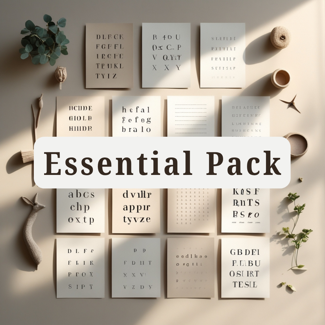
 Sale
SaleEssential Pack
Regular price €100,00 EURRegular priceUnit price per€125,00 EURSale price €100,00 EURSale -
Premium Pack
Regular price €500,00 EURRegular priceUnit price per


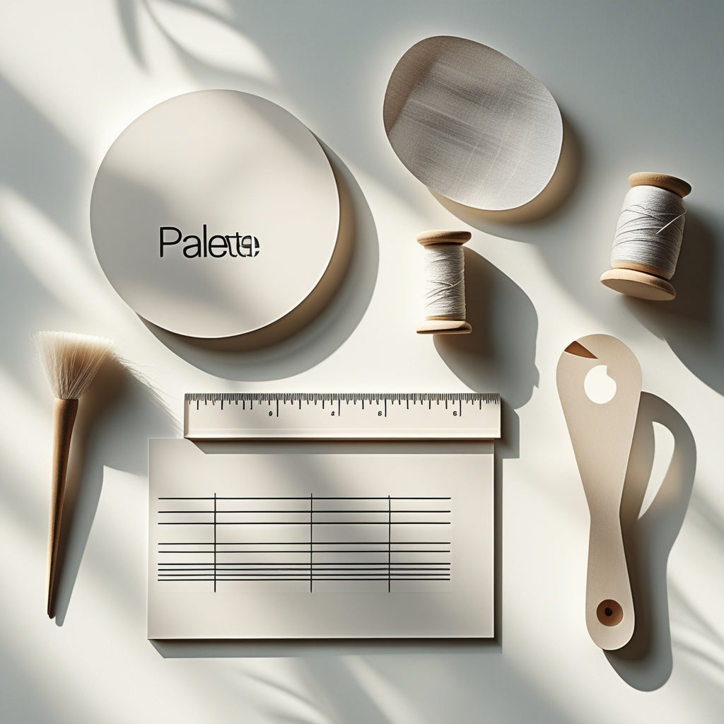
Our Approach
-

Visual clarity:
forms without overload -

Lightness:
smooth transitions and gentle outlines -

Unity:
fonts carry a shared tone and aesthetic


The team behind Fonteliere
-

Charlotte Whitley
A type designer with a background in object design. Her work blends observations from physical materials with graphical focus on form. She values clarity and precise choices in every collection.
-

Marianne Keller
Specializes in visual systems and composition. Her interest lies in the connection between logic and subtle rhythm. She develops typefaces that fit into considered, calm environments.


Using Fonts Thoughtfully
-

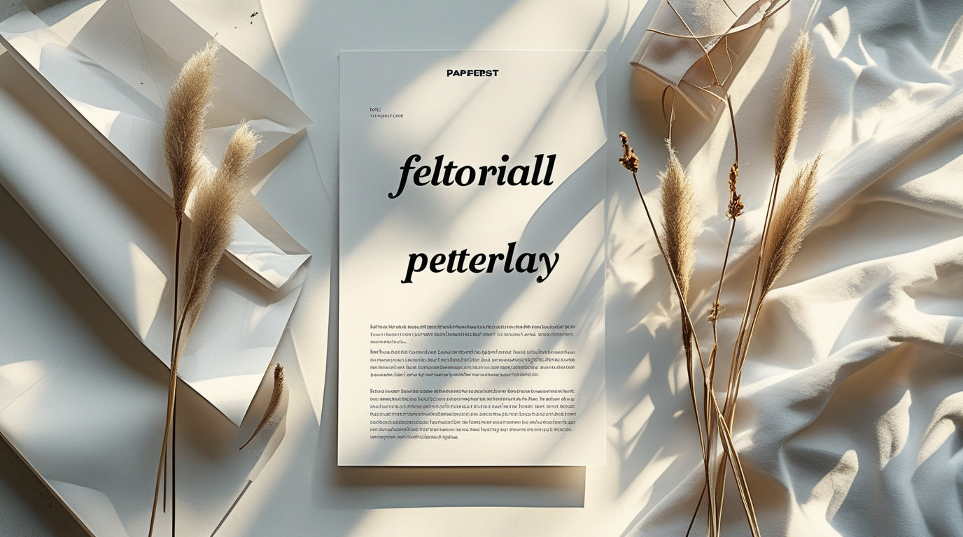
On postcards:
supports meaning without distraction -

On packaging:
sets a soft visual tone -

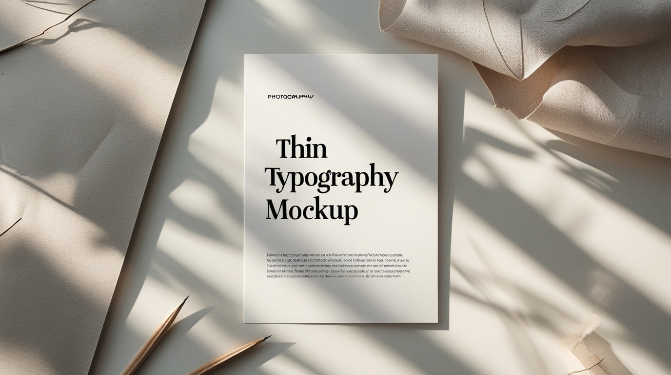
In mockups:
complements the overall rhythm